VR Viewer
UIUX DESIGNER & RESEARCHER • VR & MOBILE & WEB
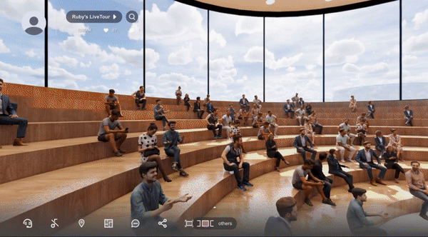
Richer Experience of Virtual Exhibitions & Showrooms
CONTRIBUTION
Researcher
UI Designer
SKILLS
User Research
Product thinking
Prototype
Interaction design
Visual design
TOOLS
Figma
Invision
HTML/CSS
TIMELINE
10/2021 - 4/2022
8 months
OVERVIEW
As a UIUX Product Designer at iStaging, I revamped the VR Viewer. This project, used for virtual exhibitions and real estate, had problems with low user immersion and a complex interface. My role combined UI design and research. I analyzed metaverse UI trends, designed several wireframes, and tested them for usability. My efforts led to a clearer UI guideline and a new design prototype. The result was a 22% rise in user engagement and a 20% longer session time, confirmed by GA insights.
DELIVERABLES
Web VR UI
For the Web VR interface, I focused on creating a visually appealing and intuitive design. The screens were detailed, building on the wireframe layouts. We chose iStaging pink as the primary color to reflect the brand's identity. Windows and pop-ups were designed with 90% transparency and a 20% background blur, a decision based on multiple tests and iterations. The icons were designed to be light and refreshing, complementing the modern and minimalistic style of the interface. A key feature was the browsing and switching of panoramas, inspired by Netflix's hover-and-enlarge approach for their film lists. This made navigation more intuitive and visually engaging.


Mobile VR UI
In the Mobile VR design, user experience was paramount. Similar to the Web VR, we maintained a consistent visual theme with iStaging pink and light, refreshing icons. However, special attention was given to touch interactions and ease of use on smaller screens. The panorama list interaction was simplified for better mobile usability. The blooming circle indicator, showing the current panorama, and white stroke highlights for hovered panoramas, were optimized for touch interaction, ensuring that users could easily navigate and switch between different views. The overall design aimed at delivering a seamless and engaging VR experience on mobile devices.


CHALLENGES & LEARNINGS
The initial challenge in this project was to ensure comprehensive coverage of product's needs within a tight timeframe. To achieve this, extensive collaboration and communication with key stakeholders, including the store manager, staff, and suppliers, were crucial.
Balancing Aesthetics
Adapting the design to fit various brands was challenging. I learned to use a flexible color scheme and design elements to make the interface suitable for different industries.
Web VR to Actual VR Transition
Ensuring a smooth transition between Web VR and actual VR required trial and error with layouts and interactions. This taught me the importance of consistent user experience across platforms.
Usability Testing
Regular usability testing was crucial. It helped refine the design based on user feedback, emphasizing the need for a user-centric approach and adaptability.
PROBLEM
Low Immersion
Users found the VR experience less engaging due to a complex interface and inconsistent design elements, making it difficult to stay immersed in the virtual environment.
Complex UI
The user interface was initially challenging to navigate, with a lack of intuitive controls and unclear user pathways, leading to confusion and decreased user satisfaction.
Aesthetic Balance for Brands
Achieving a design that was both neutral and novel for different brands and industries was challenging. The need to maintain a beautiful yet adaptable aesthetic for varied brand identities was a significant hurdle.
CONTEXT
The evolution of Human-Computer Interaction (HCI) devices has been remarkable, transitioning from web-based interfaces to immersive headset experiences. Initially, interaction was limited to common touchscreen gestures like tapping and swiping, which were intuitive but confined to two dimensions. With the advent of VR, gestures became more complex, involving whole-body movements and interactions with a 3D environment. In VR, users not only interact with a flat interface but also engage with a surrounding virtual environment, making gestures more natural and lifelike. This shift has significantly changed how we interact with technology, offering a more immersive and interactive experience.
DESIGN
PROCESS
Research & Design Development
The journey began with defining the project's scope and understanding the target audience. Research played a pivotal role, utilizing methods like competitive analysis and user surveys, which fed into crafting user flows and initial wireframes. These early designs, focusing on key user interactions, laid the groundwork for more sophisticated prototyping.

RESEARCH
HCI Device Evolution
The progression from web to mobile and VR headsets in HCI device development was crucial. I gathered background information on how devices have historically influenced user interaction. This understanding was vital to create experiences that are consistent across various platforms, from traditional web browsing to immersive VR environments.

Gesture Integration
Touchscreens have become a staple in daily life, with common gestures like swiping and zooming. These familiar interactions were considered for VR to ensure intuitive use. The goal was to design gestures for VR that felt as natural as those on a touchscreen, allowing for an easier transition and future expansions in gesture-based controls.

Environment and Interface Interaction
Our VR Viewer operates in a complex space where environment and interface intricacy intersect.
Therefore we have to consider several fundamental questions to design the user experience of such a product with the above features:
-
How do people get started?
-
When the interaction with the environment is prior to that with the interface, how to create a minimalist interface that won't overload the users with too many choices?
The challenge was to design a user experience that starts off simply and naturally guides users through more complex interactions without overwhelming them. This meant creating a minimalist interface that prioritizes interaction with the VR environment while providing clear choices for users to control their experience.


UI Style
The quest for the right UI style delved into the realms of Glassmorphism and Minimalism. User testing revealed that while Glassmorphism felt too frivolous, Minimalism lacked usability. Stakeholders desired an interface that blended simplicity, functionality, and novelty. This feedback set our design target: to craft an interface style that suits the tactile nature of mobile devices, the aesthetic of web platforms, and the innovation of VR headsets.

DESIGN
GUIDELINES
For this project, I developed a comprehensive set of brand visual and UI guidelines, filling a critical gap in iStaging's existing framework. Recognizing the necessity of a unified visual language, I established clear directives for colors, typography, and visual communication elements. These guidelines served as a foundational tool to ensure consistency and coherence across all design facets of the platform, paving the way for a robust and scalable design system.


Brand Visual Guideline
The Brand Visual Guideline is a concise manual for our brand's aesthetic, detailing the essentials: fonts, colors, gradients, and logo usage. It's crafted to unify our visual presence and maintain consistency across all platforms.
UI Component Library
In the UI Guideline, my collaboration with front-end engineers was crucial. We established a set of UI components—like buttons, text fields, and other elements—aligned with Vue.js (shown here) to streamline design and ensure smooth future updates.
DELIVERABLES
UI Design
The UI Design deliverable was a meticulous translation of features into a logical, interconnected flow across detailed, pixel-perfect screens. Effort was focused on ensuring all features were captured and the user flow was intuitive. The visual design prominently featured iStaging pink to reflect the brand, with windows and pop-ups styled in 90% transparency and a 20% background blur for clarity and focus. Icons were designed to be light and crisp, complementing the modern and minimalist aesthetic.


Prototyping
For Prototyping, close collaboration with the engineering team was essential. Together, we crafted an interactive high-fidelity prototype that allowed stakeholders to fully engage with the product. This prototype enabled users to navigate the VR environment effortlessly, with interactive elements ensuring an immersive experience. User testing with this prototype was pivotal in confirming system stability, usability, and the overall impact of the interaction design. Below is the old version (left) of VR Viewer, and the improved one (right). We tested both versions and conducted surveys in the difference of interacting.

Before
The before version of VR Viewer displayed all the interactive components on the home screen, including the panorama panel (occupied half of the screen), the feature button (on the left), and the theme title (on top). This led to limited vision and interation with the environment.
After
The improved VR Viewer maximize the environment view and keep all tool icons unfolded at the bottom, with hover tooltips. Panoramas are shown when the animated button is clicked, with clearer texts and more immersive design.
USABILITY
TESTING
Feedback Collection Methodology
We implemented various methods like client interviews and usability tests to gather feedback on our VR Viewer prototype. This approach aimed to understand user experience aspects that needed refinement for the next version. The focus was on real-world usage scenarios and direct user feedback, providing insights into areas like feature understanding and user interaction.
Efficient Testing within Constraints
Given a tight two-week deadline, we conducted focused usability testing within our company, targeting users unfamiliar with the product. This process included briefing participants, setting tasks, conducting interviews, and collecting feedback. Key insights emerged regarding character size, feature button clarity, and user task management, guiding us in refining the VR Viewer for practical use and enhanced user experience.


ITERATION
Character and Button Sizing
Following user feedback, the size of characters and buttons underwent a significant redesign. I adjusted their dimensions for better visibility and ease of interaction, ensuring that these elements were easily accessible and readable across all devices.


Responsive Web Design (RWD)
To accommodate various device types, I focused on enhancing the responsive design. This involved ensuring that our VR Viewer adapted seamlessly to different screen sizes, maintaining functionality and aesthetic integrity whether accessed via web, mobile, or VR headset.


Clickable Elements Enhancement
I improved the interface to make certain buttons and panoramas more clickable and intuitive. Inspired by Netflix's interactive film lists, the panorama list was designed to enlarge upon hovering, with a blooming circle indicating the current view and white strokes highlighting the panorama selection. This not only made navigation more intuitive but also added a dynamic, engaging element to the user experience.
FINAL DESIGN
The final design of the VR Viewer showcases enhanced usability and aesthetics. We optimized the sizes of characters and buttons for better readability and interaction. The responsive design ensures a smooth experience on various devices. The panorama list, inspired by Netflix's interface, enhances navigation with interactive elements, making the VR experience more intuitive and engaging for users.

TAKEAWAYS
Creating a Reconciling Product
The key was to design a UI that resonated across diverse industries, from art museums to luxury brands. The challenge lay in crafting a style that was technologically savvy yet not overly flashy, elegant but practical, and professional without being dull. The solution? Minimalism. This approach perfectly balanced these needs, delivering a design that appealed to our varied clientele.
Value of Usability Testing
My first solo venture into UX research and usability testing proved invaluable. It uncovered user issues like character size, icon clarity, and layout responsiveness. The direct feedback from interviews provided essential insights, especially regarding real user interactions with the prototype. This process emphasized the effectiveness of sharing work with others to identify and address user challenges early on.