Pilot in Space
UIUX DESIGNER & RESEARCHER • VR & MOBILE & WEB
Pre-record the pilot to guide
users around your VR space
CONTRIBUTION
Researcher
UI Designer
SKILLS
User Research
Product thinking
Prototype
Interaction design
Visual design
TOOLS
Figma
HTML/CSS
TIMELINE
09/2022 - 10/2022
2 month
OVERVIEW
Pilot, a feature in VR Maker, guides users through LiveTours, allowing hosts to create and display various guided routes. Designed to increase visitor engagement and understanding, it initially struggled with user adoption due to issues like low ease of use, poor information sourcing, lack of responsiveness, and suboptimal output quality. By redesigning the interface for better usability, enhancing information accessibility, implementing responsive design, and improving system performance, these issues were addressed. Consequently, this led to a 15% rise in user engagement and a 54% improvement in user feedback.
DELIVERABLES
Web VR UI
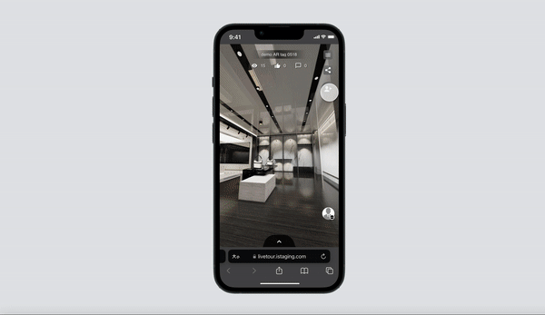
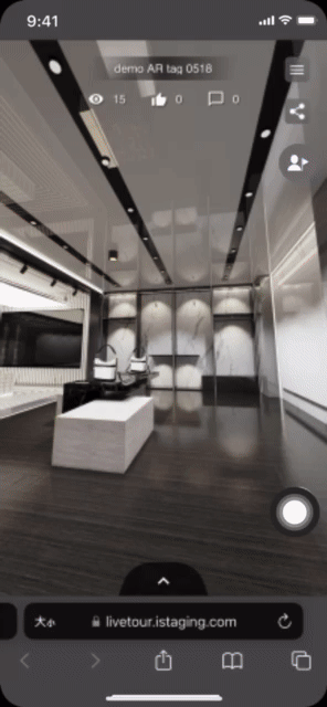
For the Web VR interface, I designed an animated call-to-action (CTA) button for the Pilot feature, encouraging users to engage with it. This animation subtly guided users to click on the button, which in turn led to the automatic playback of pre-recorded pilots. Users could also choose their preferred content and tour guide. This enhancement was reflected in increased user engagement metrics on Google Analytics.


Mobile VR UI
In the Mobile VR realm, I focused on creating a responsive and user-friendly interface. Taking cues from popular apps like Spotify, the design ensured that users could easily navigate and interact with the content on their mobile devices. This approach made the VR experience more accessible and familiar, thereby enhancing user interaction and satisfaction on mobile platforms.

PROBLEMS
Low Feature Visibility
The Pilot function was not well-known among users, primarily because it was inconspicuously placed among several other tool buttons. This lack of visibility made it difficult for users to recognize and utilize this potentially valuable feature.
Confusing UI Design
The user interface of the Pilot feature was complex and disorienting. Users frequently faced uncertainty about the actions and outcomes associated with clicking on various elements like panoramas, the pilot itself, or tour guides. This confusion hindered intuitive navigation and detracted from the overall user experience.
GOALS
Increase Feature Awareness
A primary goal was to enhance the visibility and awareness of the Pilot feature. This involved redesigning its placement and presentation within the toolset, ensuring it stood out and was easily accessible to users.
Simplify UI
Another key objective was to streamline and clarify the Pilot's user interface. The focus was on simplifying the design and making the navigation logic more intuitive. By doing so, the goal was to eliminate user confusion and create a more straightforward, predictable experience when interacting with panoramas, the pilot feature, and tour guide selections.
DESIGN
PROCESS
Discover and Define
The first phase in our design process is about uncovering and understanding the problems. This involves close collaboration between stakeholders, product managers, and developer team to pinpoint the challenges users face and the demands of the business. Together, we define the scope of these problems to find the right issues to address.
Design and Usability Testing
Next, we move into the design phase, where me and other UI/UX designers propose feasible solutions. These potential solutions are then put through usability testing, with designers leading the practice sessions to collect feedback. This step is crucial to refine the interface and ensure it meets user needs.
Develop and Deploy
The final stages involve turning the tested solutions into a viable product. Developers and UI designers work hand-in-hand to build the product, followed by deployment where the final product is launched. Post-launch, we track metrics to measure success and inform any necessary adjustments.

RESEARCH
Past User Experience
We launched a comprehensive survey and conducted interviews with our seasoned customer service team to gather feedback on the Pilot feature. It became evident that many users were not familiar with Pilot, with only a few using it occasionally. We assessed satisfaction through various indicators like system speed, stability, content quality, interface design, and product features. The findings pointed out a need for improvements in system stability and content quality in the editor, while interface design emerged as a starting point for enhancements on the viewer side.

Feature Prioritization
We delved into the client's perspective by asking what they valued most about our Pilot. The feedback highlighted that while our features were appreciated, the ease of use and user interface fell short of making the experience enjoyable. This insight directed us to prioritize refining the usability and interface design to enhance client satisfaction and engagement with the Pilot feature.

INTERACTION
DESIGN
Wireframe
The journey begins with constructing wireframes, the blueprints that lay out the structure of our Pilot feature. This stage is about mapping out the user flow and establishing a solid foundation for the interface, ensuring that each screen is planned with precision and purpose.

UI Design
Building on our wireframes, the UI design phase involves crafting each screen with attention to detail, ensuring pixel-perfect visualization. Here, inclusivity and accessibility are key; we strive to create a design that's intuitive and welcoming for all users. Using Figma, we bring the Pilot user flows to life with prototypes that not only look good but also feel right to use.

USABILITY
TESTING
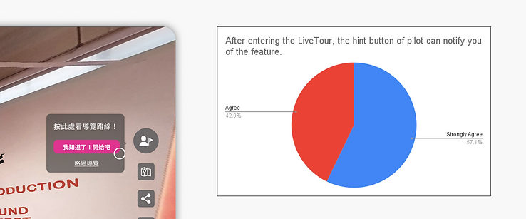
Surveys
We rolled out a prototype of the improved Pilot version 1 and surveyed users to gauge the effectiveness of new feature hints designed to boost usage. The feedback was encouraging: over half of the users strongly recognized and appreciated the hint, and nearly all others agreed it was effective.
For the responsive mobile version of Pilot, we created an interactive prototype and collected user opinions on the readability and layout. Some users reported challenges with reading text and understanding how information was presented. This feedback highlighted areas for enhancement in mobile viewing experience.

User Insights Through Focus Groups
Deeper conversations with users who struggled with readability and organization led to the identification of five key usability issues:
-
Scrollable Content Indication: Users were not aware of scrollable content in the playlist page, misled by a down-arrow button that suggested expansion rather than scrolling.
-
"Chapter" Element Confusion: The "Chapter" terminology and its design on the playlist page were puzzling, with users failing to connect it to the media play bar.
-
Guide and Routes Differentiation: The round components for guides and routes lacked distinction, causing information overload on the playlist page without clear differentiation of information types.
-
Pilot Menu Visibility: The pilot menu button was often perceived as disabled, and its accompanying hint was mistaken for a non-interactive element, leading users to overlook the page entirely.
-
"Guide" Label Clarity: The term ‘Guide’ was not sufficiently descriptive for users to understand that they could select a specific guide to view associated routes.

ITERATION
Scrollable Content Button
To clarify the action required to view all content, the down-arrow button was replaced with a clear call-to-action labeled "View full content," which automatically scrolls users to the bottom of the page.
Chapter Clarity
I addressed the confusion around the "Chapter" component by adding the label "Route chapters" to guide users in choosing the specific chapter they wished to listen to.
Tour Route Selection
The basic term "guide" was updated to "choose tour routes by guiders," providing a more direct instruction and making the selection process more intuitive.
Refined Components for Routes and Guides
To combat information overload, I redesigned the route and guide components, using rectangles for routes with a play/pause function to signify action, and rounds for guides, enhancing the distinction between the two and aiding users in quickly understanding their functionality. A dedicated pilot menu button was also introduced on the playlist page for more efficient navigation.

FINAL DESIGN
Prototypes
Below is the final Figma prototype of the web and mobile VR Pilot. After fine-tuning all the feature details, I worked closely with the developer team and product managers to complete the whole Pilot features in the 2-month sprint.
Mockups
Beside designing for the project, I also presented the product mapping and developing process and schedules to the stakeholders of the company, to make sure everyone is on the same page, and the final results are favorable. Below are the mockups that I often shown in the presentations.


KEY
TAKEAWAYS
The Value of Critiques
In this project, I had opportunity to interview to our end users in person. They gave me insightful feedback, while sometimes their honest comments may hurt. For example, one of the user said, “The function is so confusing that I don’t even wanna use it.” in person. It was hurt in the beginning, but then I asked her what part makes her feel frustrated with the design and what are the elements that she did not like. Then she pointed out the parts which have greatly help us iterate the final design. I found the way to figure out the best solution is to be open to judgement, admitting that you might be wrong.
The Avoidance of being Subjective
When I conducted usability testing via questionnaires and interviews, I found out some instructive questions might lead users to not answering what they actually think. Just as people might consider opposite opinion to jeopardize their dignity and independency, they would become defensive when being questioned. Instead, people are more willing to share when they know there’s no right / wrong answers. Therefore I spent less time on explaining how the feature works, but spending more on listening, and I found the results turned out pretty surprising.